annabelle breakey shakes up tim hortons
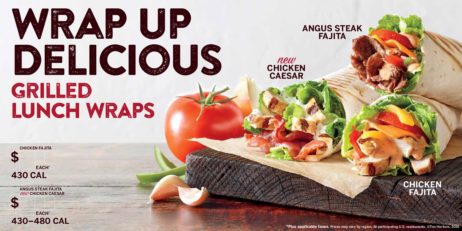
A few years ago, Annabelle Breakey was brought on to update the Burger King brand, shooting all new menu boards to be used across the country. The project, managed by Turner Duckworth in London, was hugely successful, and Annabelle was subsequently asked to come on board to shoot imagery for Tim Hortons—flagship banners, in-store experience, advertising, billboard, and web assets.
For those of you who don’t live in the Midwest or Canada, Tim Hortons is sort of the Canadian equivalent of Dunkin’ Donuts. The Toronto-based coffee retailer, which beats out even Starbucks north of the 49th parallel, is owned by the same parent company that owns Burger King and is expected to add several new stores in the U.S. in the near future.
The first image she shot was an advertisement for $1.49 breakfast sandwiches. She now receives 4,500 pounds worth of coffee, donuts, sandwiches and more seasonally at her San Francisco studio.
“We just shot new images for fall. It’s really, really fun. Who doesn’t like chocolate, donuts, blended beverages, paninis, and bagels,” said Annabelle.
The company is known for coffee and donuts, but they’re adding breakfast and lunch sandwiches and espresso drinks.
“We’re trying to create a proprietary, signature look for Tim Hortons that’s different from anything else in the marketplace. They want friendly, approachable imagery that’s slightly environmental, but first and foremost, it should look delicious. If you look at these images compared to Dunkin’ Donuts or Denny’s or Starbucks, what we’re doing is really different,” she said.
Big thanks to Matt and Rochelle from Tim Horton’s, food stylist Kim Kissling and prop stylist Glenn Jenkins for the continued collaboration.

